The data contained in a listbox can be grouped into logical sets through the use of GroupDescription objects. Multiple group descriptions can be added to the GroupDescriptions collection, but items are displayed in "flattened" groups. For example, given the following XAML, "Canada - Moncton" might appear in a group header followed by items with that country and city, followed by another group header containing "Canada - Montreal."
<sllb:ListBox.GroupDescriptions>
    <PropertyGroupDescription PropertyName="ShipCountry"/>
    <PropertyGroupDescription PropertyName="ShipCity"/>
</sllb:ListBox.GroupDescriptions>
Group Headers
Groups are preceded by group headers (see class ListBoxGroupHeader), which scroll with the groups. If the listbox uses a StackPanel or a StackView, the group headers can be made sticky through the IsSticky property of ListBoxContainerConfigurationBase. It is not possible to make group headers sticky when using PathPanel or PathView.
Group headers include three buttons that are mapped to commands:
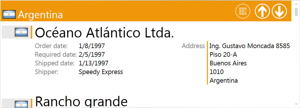
The up- and down-arrow buttons are used to navigate to the group following and preceding the group, respectively, whose header was interacted with. When a group is navigated to, it is moved to the top of the listbox's viewport. (See NavigateToNextGroupCommand and NavigateToPreviousGroupCommand.)
The third button is used to open a panel that displays the listbox's groups and allows quick navigation to the chosen group. You must set the DataNavigationControl's DataNavigationConfiguration attached property in order to activate it. (See DataNavigationControl below for details.)
The DataNavigationControl
The DataNavigationConfiguration attached property of the DataNavigationControl class accepts three types of objects: AlphabeticalDataNavigationConfiguration, RangeDataNavigationConfiguration, and CustomKeysDataNavigationConfiguration.
Setting DataNavigationConfiguration to AlphabeticalDataNavigationConfiguration causes the DataNavigationControl to display keys A through Z. The first GroupDescription in GroupDescriptions must be of type string when DataNavigationConfiguration is set to an instance of AlphabeticalDataNavigationConfiguration. The following XAML configures DataNavigationControl to use keys A through Z:
<sllb:ListBox x:Name="listBox"
              ItemsSource="{Binding}"
              ItemTemplate="{StaticResource orderListBoxItemTemplate}"
              ToolPaneVisibility="Visible">
...

  <sllb:DataNavigationControl.DataNavigationConfiguration>
    <sllb:AlphabeticalDataNavigationConfiguration />
  </sllb:DataNavigationControl.DataNavigationConfiguration>
</sllb:ListBox>
Clicking on a button in the control causes the listbox to browse to the first group whose first-level GroupDescription corresponds to that letter (see image below).
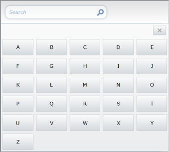
The individual items in the DataNavigationControl are represented by DataNavigationItem instances.
The RangeDataNavigationConfiguration class provides Start and End properties that represent the start and end keys of a range. A Step property determines what increment is applied between these values. Clicking on a key's button will cause the listbox to navigate to the first item whose first-level group is equal to the value of that key. The first GroupDescription in GroupDescriptions must be a numeric type when DataNavigationConfiguration is set to an instance of RangeDataNavigationConfiguration.
The CustomKeysDataNavigationConfiguration class allows the use of custom keys in the data navigation control. These keys are set through the CustomKeys property of the class.